GitHub - abikoushi/ggfloatbar: Floating bar chart on ggplot2
です。
インストールは
devtools::install_github("abikoushi/ggfloatbar")
でたぶんいけます。
たぶんまだ不具合とかあると思うし、説明とかぜんぜん書いてないです。
なにか要望とか意見、感想などあればコメントしてください。
例1
なにができるかというとこんな感じ。
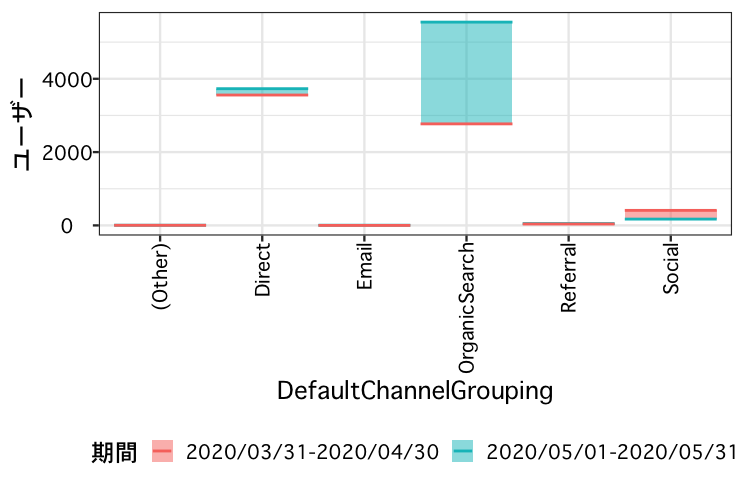
アクセス数とかを前期と比較したいときとかがありますね。
前記と今期のアクセス数を横線で表し、差分を塗りつぶしています。
library(ggfloatbar)
library(ggplot2)
library(tidyr)

dat <- read.table(text="DefaultChannelGrouping	期間	ユーザー
OrganicSearch	2020/05/01-2020/05/31	5546
OrganicSearch	2020/03/31-2020/04/30	2770
Direct	2020/05/01-2020/05/31	3730
Direct	2020/03/31-2020/04/30	3557
Social	2020/05/01-2020/05/31	172
Social	2020/03/31-2020/04/30	410
Referral	2020/05/01-2020/05/31	50
Referral	2020/03/31-2020/04/30	38
(Other)	2020/05/01-2020/05/31	5
(Other)	2020/03/31-2020/04/30	3
Email	2020/05/01-2020/05/31	5
Email	2020/03/31-2020/04/30	0",header=TRUE)

ggplot(dat,aes(x=DefaultChannelGrouping,y=ユーザー))+
  geom_floatbar(aes(fill=期間))+
  geom_float(aes(colour=期間))+
  theme_bw(base_family = "Osaka", base_size = 18)+
  theme(legend.position = "bottom")
例2
最低賃金がどれくらいあがったかとかを図示してみます。
データは:
https://www.mhlw.go.jp/stf/seisakunitsuite/bunya/koyou_roudou/roudoukijun/minimumichiran/
より(2020年7月15日アクセス)
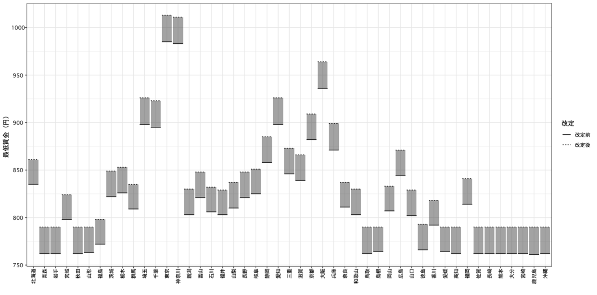
dat <- read.table(text="都道府県名	改定後	改定前	発効年月日
北海道	861	835	令和元年10月3日
青森	790	762	令和元年10月4日
岩手	790	762	令和元年10月4日
宮城	824	798	令和元年10月1日
秋田	790	762	令和元年10月3日
山形	790	763	令和元年10月1日
福島	798	772	令和元年10月1日
茨城	849	822	令和元年10月1日
栃木	853	826	令和元年10月1日
群馬	835	809	令和元年10月6日
埼玉	926	898	令和元年10月1日
千葉	923	895	令和元年10月1日
東京	1013	985	令和元年10月1日
神奈川	1011	983	令和元年10月1日
新潟	830	803	令和元年10月6日
富山	848	821	令和元年10月1日
石川	832	806	令和元年10月2日
福井	829	803	令和元年10月4日
山梨	837	810	令和元年10月1日
長野	848	821	令和元年10月4日
岐阜	851	825	令和元年10月1日
静岡	885	858	令和元年10月4日
愛知	926	898	令和元年10月1日
三重	873	846	令和元年10月1日
滋賀	866	839	令和元年10月3日
京都	909	882	令和元年10月1日
大阪	964	936	令和元年10月1日
兵庫	899	871	令和元年10月1日
奈良	837	811	令和元年10月5日
和歌山	830	803	令和元年10月1日
鳥取	790	762	令和元年10月5日
島根	790	764	令和元年10月1日
岡山	833	807	令和元年10月2日
広島	871	844	令和元年10月1日
山口	829	802	令和元年10月5日
徳島	793	766	令和元年10月1日
香川	818	792	令和元年10月1日
愛媛	790	764	令和元年10月1日
高知	790	762	令和元年10月5日
福岡	841	814	令和元年10月1日
佐賀	790	762	令和元年10月4日
長崎	790	762	令和元年10月3日
熊本	790	762	令和元年10月1日
大分	790	762	令和元年10月1日
宮崎	790	762	令和元年10月4日
鹿児島	790	761	令和元年10月3日
沖縄	790	762	令和元年10月3日",
                  header = TRUE)

dat$ord <- 1:nrow(dat)
dat2 <- gather(dat[,-4],key = "改定",value = "value", -ord,-都道府県名)

ggplot(dat2,aes(x=reorder(都道府県名,ord),y=value))+
  geom_floatbar()+
  geom_float(aes(linetype=改定),size=0.5)+
  theme_bw(base_family = "Osaka")+
  xlab("")+ylab("最低賃金(円)")
例3
3つ以上の期間の比較も一応できます。
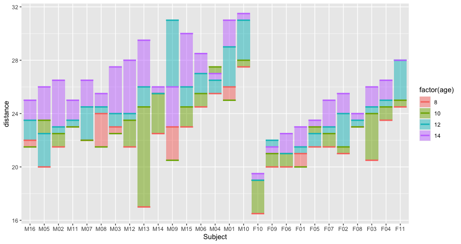
data(Orthodont,package = "nlme")

ggplot(Orthodont,aes(x=Subject,y=distance))+
  geom_floatbar(aes(fill=factor(age)))+
  geom_float(aes(colour=factor(age)))
でもあんまり見やすくないかも。
参考にしたものなど
https://daliaresearch.com/blog/democracy-perception-index-2020/
に出ているグラフがかっこよかったので作りました。
プレイフェアの線グラフ:
近代的グラフの発明者ウィリアム・プレイフェア|Colorless Green Ideas
でx軸が名義尺度になったイメージでもあります。